In this blog, PrOPEL Hub partner Professor Alan Felstead from Cardiff University introduces his on-line quiz which allows people to see how the quality of their jobs compare to those held by others.
The quality of jobs varies. Some allow workers greater voice, better work-life balance and enhanced promotion prospects. While others provide workers with lower job security, poorer management support and lower pay. However, we often do not know for sure in what ways and to what extent job quality varies. This means that judgements about job quality are often made on flimsy, and even hearsay, evidence.

It is true that there are periodic national surveys of job quality which question representative samples of workers about their jobs. These surveys provide insights into the changing world of work. For example, these surveys show that Zero Hours Contracts are the tip of the insecurity iceberg. Estimates suggest that there are three times as many employees who are very anxious about unexpected changes to their hours of work than there are employees on Zero Hours Contracts. Also anxiety over unexpected changes to working hours goes hand-in-hand with other features of poor work. The pay of these workers tends to be lower, work intensity higher, line management support weaker, and the threat of dismissal and job loss greater. In addition, these surveys show that since 2006 the speed of work has increased – an extra 7 percentage points were added between 2006 and 2017 to the proportion reporting that they work at very high speed for three-quarters or more of their time.
However, these national surveys are of little help to individual workers who wish to benchmark their job quality against their peers in terms of, say, line management support or work intensity. The www.howgoodismyjob.com quiz aims to meet this need. It consists of a short set of empirically validated survey questions. In exchange, all quiz takers are presented with a ‘job quality results dashboard’ which benchmarks their job against those in similar occupations as well as against the average job in Britain across ten domains. The comparator data for the quiz are taken from two national surveys carried out by a Cardiff University-led research team in 2012 and 2017.
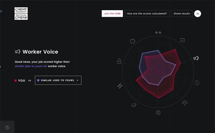
The results are displayed in a spider plot. Symbols are chosen to represent the ten dimensions of job quality and are dotted around the perimeter of the plot. By hovering the cursor over the symbols, the quiz taker’s job is benchmarked against two national surveys carried out by the Cardiff University-led research team. Moving the cursor around the perimeter of the spider plot generates statements announcing the job as better, worse or about the same according to the dimension of job quality chosen. These statements appear to the left of the plot. Quiz takers can choose between two comparators – jobs which are similar in terms of skill level as defined by the 1-digit Standard Occupational Classification system or jobs in general. A drop-down menu allows quiz takers to switch back and forth between the two comparator groups, while moving the cursor around the perimeter shines a light on particular aspects of job quality.
To date approximately 50,000 people have taken part in the quiz. All the data collected are anonymous. Visit www.howgoodismyjob.com to get detailed feedback on your job and to find out how it compares to the jobs held others.